

No More Chatbots
We Need Better AI UX

Every product either has AI features, or will have them soon. In the age of AI, it’s become expected that there is some magical automation available everywhere.
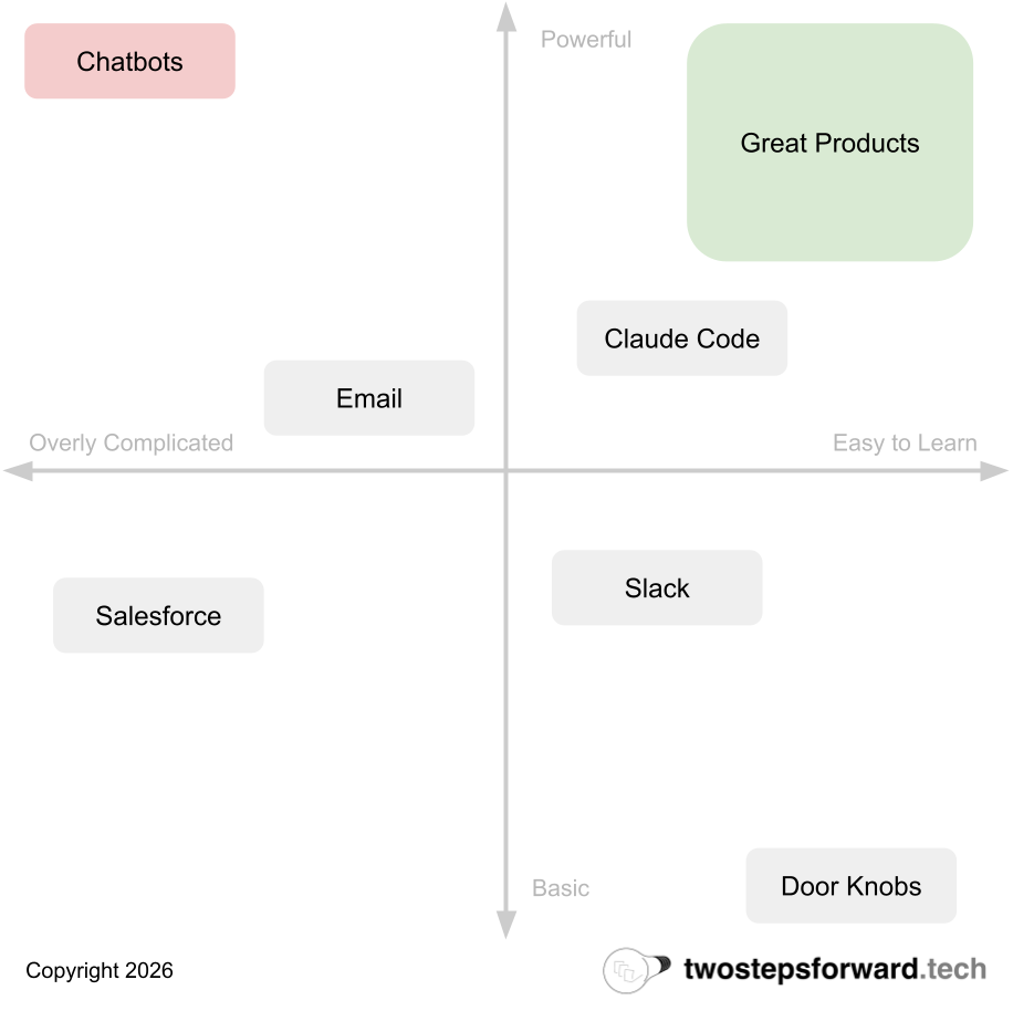
Unfortunately, almost all of these features take the form of chatbots. Bolted onto the side of the product is a chat where you can interact with AI and maybe accomplish your goals.
The experience of using these chatbots is generally very poor. They are disconnected from the user interface of the rest of the product, and it’s never clear exactly what they can or cannot do. They all have cute personal names like “Bradley” or “Veronica” to make them seem accessible but trying to use them is an exercise in frustration.
Part of the cause is that these features really are bolted onto existing products. Some of them are third party tools, but even the natively built versions are not part of the main application experience. They cannot do very much in the application other than explain how you can do things, like an online support agent. Instead of a magical AI assistant, they are more like an AI spectator that can look at the product but not do much.
But the biggest cause is that chatbots themselves are a horrible user experience.
What is a great user experience?
If you are a software developer, or someone working in the technology industry, you’re comfortable with playing with software. In fact, playing with software is likely how you teach yourself to do things. You try something, see if it works, rinse and repeat.
Most people outside of the technology industry don’t think about software that way. Years of fragile tools have taught them that doing the wrong thing, or typing the wrong thing, can break systems and delete data. Most people use software because it’s a part of their job, and their biggest fear is getting fired.
As a result, that chat box that seems so welcoming to someone who learned to use computers on the command line is an impenetrable fortress to non-technical folks. They don’t know what to type in the box, and are afraid if they type the wrong thing it might have catastrophic consequences.
A great user interface is one that explains itself to the user as part of the interaction of using it. The Design of Everyday Things (although a bit dated now) explains this exceedingly well even though it was written before the internet age. A great product does not require a long training session or user manual, it allows the user to teach themselves.
Chatbots are the opposite of this. They provide no coaching or expectation setting, and assume a very deep understanding for even a first time user. Even if you provide example prompts, it’s not entirely clear what outcome they will create or how long that might take.
Chatbots offload all of the work to the end user.
It doesn’t need to be this way! AI really can do amazing things, but not if we continue to push the onus onto the user to know how and when to use it. Instead of chatbots we need a new generation of AI user experience models.
The “Do It For Me Button”
What would a better AI user experience look like?
Imagine you are in the process of planning an elaborate event. You’re using event planning software which has countless options to choose from and requires a lot of tracking of dependencies.
If you wanted to add an AI chatbot to this interface, how would it work? Maybe the user types in “plan my event” and the AI then proceeds to ask a series of questions to distill the user’s intent. But how would the user know to type that, or that the interview would ensue? What if it didn’t, and the AI went ahead and planned a random event instead?
Now, think about the same product interface. As the user begins to plan the event, a button appears called “Do This For Me” after they have filled out enough of the existing product experience to know what they intend for the party. If you click the button, it finishes setting everything up for you.
The product looks the same it did before AI, just with a new button that appears.
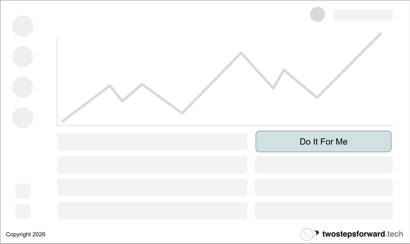
The button explains what it does! “Do It For Me” is as clear as you can get. The system did the work of deciding when it knew enough to complete the task, and the user just had to make one decision: do you want it to do it for you?
This kind of interface is much more accessible to users, as a button feels deterministic. Instead of needing to craft the perfect prompt, all they need to do is click.
But what if it’s more complex than that? What if you need more information to do it for them? The “Do It For Me” button doesn’t need to be the only part of the experience, it just needs to be the beginning. An easier, more accessible on-ramp to using AI.
In fact, the “Do It For Me” button might launch a chatbot! Instead of asking the user to drive, it takes care of starting the conversation and setting up the intent so the user is along for the ride.
The Bottom Line
This is just an example of how rethinking the user experience of AI features can work, and how the user can perceive very simple changes in very different ways. It might not make sense to pepper “Do It For Me” buttons everywhere in a product, but what simple mechanisms can you provide that are easy on-ramps?
Chatbots are popular because they are easy. They are easy to implement, easy to add and easy to think about. However, great interfaces are about the user and not the maker. In making it easy for the people building the product the user takes on the most difficult tasks.
For AI to succeed, the opposite needs to be true.
Totally agree! I learned many of these lessons the hard way when we implemented AI chat bots in the LinkedIn experience. While the chat bot might be capable of doing a lot for the user, the users don't know that upfront. You have to make it easy for users to know what they are signing up for
Whether it's a chatbot or a contextual button, the question still remains: did the customer actually succeed / get what they wanted? Most teams building AI features today can answer 'did the user engage?' but not the 'did they accomplish their goal?' That's the real blind spot, regardless of UX paradigm.